Mentor APM
Enhancing Asset Management Experience

STEP 1
DEFINE
UNDERSTANDING THE PROBLEM
The existing MentorAPM mobile app was outdated and inefficient, leading to significant struggles for field workers tasked with logging asset data in challenging environments. The app’s clunky navigation, inconsistent features, and poor accessibility hindered productivity, causing delays and increasing the risk of errors. A comprehensive redesign was needed to streamline workflows, and, enhance usability.
STAKEHOLDER INTERVIEW INSIGHTS
Incremental Enhancements
The application followed a monthly sprint cycle, requiring continuous improvements and the integration of new features with each release.
Modernized Look & Feel
Stakeholders wanted the app to align with contemporary design standards, offering a visually appealing and engaging user experience.
Simplified Navigation
The existing mobile app had deeply nested features that made it difficult to use. Streamlining these complexities was a top priority.
Consistent User Experience
The web and mobile versions of the app had inconsistencies, and stakeholders emphasized the need for a cohesive experience across platforms.
Field Worker-Centric Design
The redesign had to focus on usability in challenging environments, ensuring quick access to critical features while reducing cognitive load.
STEP 2
DISCOVER
UNCOVERING USER NEEDS AND PAIN POINTS
In this phase, I focused on understanding the real-world challenges faced by the field workers using the MentorAPM mobile app. Through user interviews and research, I gathered critical insights to inform the redesign. By empathizing with the users and closely analyzing their feedback, I was able to uncover the most pressing issues that needed to be addressed in the redesign.
USER INTERVIEW INSIGHTS
Difficult Navigation
Users found the app cluttered, with deeply nested menus making it hard to locate key features.
Cumbersome Asset Logging
Uploading images and adding details required too many steps, making the process tedious.
Slow Performance
The app was laggy, causing frustration during field operations.
Poor Readability
Low contrast and small text made it hard to use outdoors.
Inconsistent Experience
Features differed between mobile and web, disrupting workflows.

KEY CHALLENGES
Outdated Mobile App
The app was inefficient, hindering field workers’ ability to log data accurately.
Complex Navigation
Deeply nested features made it difficult for users to find critical tools quickly.
Inconsistent Experience
The mobile and web versions had design and functional inconsistencies.
Field Work Usability
The app needed to be optimized for use in challenging outdoor environments.
Ongoing Feature Integration
Monthly sprints required continuous design updates and feature additions.

STEP 3
IDEATE
SOLVING THE PROBLEM
To address the challenges faced by field workers using the outdated MentorAPM mobile app, I led a comprehensive redesign focused on simplifying navigation, enhancing performance, and ensuring accessibility in diverse field conditions. By leveraging user research insights, I streamlined workflows, reduced cognitive load, and ensured a consistent and intuitive experience across both mobile and web platforms. Key features such as AI-powered asset logging and improved readability in outdoor environments were integrated, significantly improving usability, efficiency, and overall user satisfaction.
FEATURES ADDED
Tab Navigation
For simplified and organized workflow.
Splash Screen Animation
Enhanced onboarding experience.
Asset Lens
AI-based condition assessment and nameplate extraction.
Asset Inspection Templates
Streamlined asset data entry.
Scalable Text & Buttons
Improved readability and accessibility.
Personalized Messages
Custom greeting for users.
Quick Access Shortcuts
Efficient shortcuts for key features.
.png)
STEP 4
DESIGN
CREATING THE SOLUTION
In this phase, I focused on understanding the real-world challenges faced by the field workers using the MentorAPM mobile app. Through user interviews and research, I gathered critical insights to inform the redesign. By empathizing with the users and closely analyzing their feedback, I was able to uncover the most pressing issues that needed to be addressed in the redesign.
DESIGN SYSTEM
Scalable & Cohesive
Established reusable components, typography, color systems, and interaction patterns to enhance the user experience while optimizing development workflows.
.png)
.png)
.png)
.png)
.png)
SPLASH SCREEN ANIMATION
Feedback received for animation
"This is the first time it felt like I work for a real company."
"This looks amazing! How soon can the developers code & implement it on the app?"
"This is perfect! I want it to be added as it is, no changes, it cannot be more perfect."


VISUAL SCREEN DESIGNS
Version1
Focused more feature implementation, like incorporating tabs for easy navigation, added page headers to make application more user friendly
Version2
In second iteration I focused more the on aesthetic components of UI. Added color gradient background, changed icons, also changed the text font to Poppins
STEP 5
PROTOTYPE
ADDING INTERACTION TO THE DESIGN
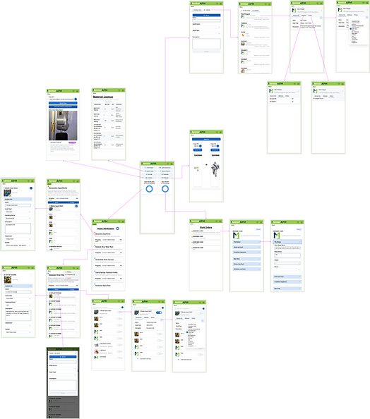
Created high-fidelity prototypes using Figma to simulate the user flow and interactions. I utilized auto-layout and component-based design to ensure responsiveness across devices. Key features like Asset Lens and Tab-Based Navigation were incorporated with interactive hotspots and transitions. Using Figma’s prototyping tools (smart animate, overlays, and timed transitions), I tested the user experience to ensure functionality and usability before moving to development.
INTERACTIVE PROTOTYPE
The prototype focused on scalability, accessibility, and user-friendliness. I optimized the design for responsive layouts to ensure smooth performance across various devices. The user flow was streamlined, reducing friction and making asset logging more efficient and intuitive. For accessibility, I increased text size, adjusted color contrast, and ensured readability in outdoor conditions. I also added dynamic dropdowns for easy access to asset details, enhancing navigation. To improve engagement, I included a Personalized Welcome Message and Splash Screen Animation for a smoother onboarding experience. Tab-Based Navigation simplified access to tools, while maintaining cross-platform consistency. This design approach created a user-centered, interactive experience that supports both field and office workers.

DESIGN DOCUMENTATION
Created design documentation

STEP 6
TEST
VALIDATING THE SOLUTION
In this phase, I focused on understanding the real-world challenges faced by the field workers using the MentorAPM mobile app. Through user interviews and research, I gathered critical insights to inform the redesign. By empathizing with the users and closely analyzing their feedback, I was able to uncover the most pressing issues that needed to be addressed in the redesign.
STAKEHOLDER TESTING
Preference Testing
Presented different design options and asked stakeholders which one they preferred. This helped gauge which design resonates better with stakeholders based on aesthetics, usability, or business goals.
Prototype Testing
Provided stakeholders with the prototype and let them interact with it to explore features. This helpd validate design functionality and usability before full development.


STEP 7
MONITOR
TRACKING IMPACT & ITERATING FOR GROWTH
Collaborated with cross-functional teams to analyze user feedback, identify pain points, and drive iterative improvements. By leveraging insights from data and user testing, fine-tuned the design to enhance usability, ensuring a seamless and user-centered experience.


CONCLUSION
In this phase, I focused on understanding the real-world challenges faced by the field workers using the MentorAPM mobile app. Through user interviews and research, I gathered critical insights to inform the redesign. By empathizing with the users and closely analyzing their feedback, I was able to uncover the most pressing issues that needed to be addressed in the redesign.


